New blog

All new content on my restarted blog is here

Saturday, March 24

Channel Four's interactive deadend

Watched Davina McCall's piercing look at the UK's abysmal Sex Education in schools on Friday. (Apparently the right-wing press had been creating "Outrage as Ch4 show gives condom lesson to youngsters." all the last week, passed me by ... )

It particularly seemed aimed at parents and involved parents. It was quite a grown up show, though if I see another 'mother' balking at even the bare acknowledgement that some people are gay ... Davina did at the one mention in the whole hour, literally six year olds (in sensible Holland) being asked 'and what do you call a man who loves another man?' in a lesson about LOVE... she reminded me of mothers interviewed in leafy Richmond who didn't want their kids readng

'Spacegirl Pukes' - an adventure for young astronauts

When nausea grips intrepid Spacegirl on the day of a mission to the stars she is lucky to have two mummies to help her out, but soon - yes - everyone is going "Bleurgh!"
Sounds offensive doesn't it?

Anyway, the final shot was her yelling into the camera right at us 'AND WHAT DO YOU THINK?' Now you'd expect something to flash up afterwards, however given the bad press around pound-a-minute phone lines, it'd be the website?

Wrong. There was no specific link to anywhere to 'TELL US WHAT YOU THINK'. On Channel Four's website, below the big picture advertising the teen sex-fest Skins, was the link through to 'Lets Talk Sex' and here we have the options under the heading DO SOMETHING

  • The Sex Test
    the same 200 questions Davina did (did you know sperm hangs around in the vagina for five days? or that sperm travels at 28 mph?). I got 30/45 when you're told by them if you get less than 35 you're ignorant. But there were two duplicates and some of the questions don't exactly seem like one's vital for anyone to know about.
  • Have your say
    "The debate on this site is now closed"
    "Why not write to your MP and tell them your views."
  • Polls
    Tell us what you think by voting in our polls.
    Should sex education be compulsory in the UK for all pupils regardless of their parents' wishes? Vote now.
    At what age should sex and relationships education begin at school? Vote now.
There is a 'Resource aimed at all those involved in delivering sex education (Word 185Kb)' and many links but it's not exactly Jamie Oliver, is it? It all ends up at 'Write to your MP'? If I was a parent wanting a lead as to how to get things changed I'd feel a little lost after Davina's in-my-face exhortation?

Real Estate Bubble Map wiki


"The goal of this experimental wiki is to protect homebuyers from overpaying in overvalued housing markets across the United States. Citizen journalists, particularly homebuyers turned embedded real estate reporters and buyer agents, are invited to add newspaper articles, favorite blog posts, and most importantly examples of falling prices to document what is really going on behind housing statistics, like median sales prices, that may understate changes occurring in local housing markets (see partial list of cities in sidebar)."
Real Estate Bubble Map wiki
created using the new tool Platial.

Miliband's pique in fits

A journalist friend of mine has been exchanging comment off-blog with me after my post Matthew Taylor is an ignoramus. A point he's made is that politicians and their ilk just aren't suited to actual interactivity. Today's post by GuidoFawks does suggest this is true!

Miliblogger Sulking, De-linking

Miliband has, in an incredibly revealing fit of pique, now removed his link to this blog from his blog-roll, (he only added Guido to his blog-roll a month ago for some blogospheric street cred). This follows the New Statesman recently removing their blog link last month after Guido criticised them for not covering the Smith Institute scandal, despite them sharing an office with the Sith. Is Guido bovvered?

This proves Guido's oft made point about politicians and their alleged desire for an interactive online conversation with the public, they only want agreement and consent, not dissent. How enjoyably childish of Miliband.

The case for Wikipedia

There's been quite a bit of anti-Wikipedia articles in the media of late, perhaps sparked by the arrival of an anti-Wikipedia movement — led by right-wing American evangelicals. Then there was the Editor exposed as a fraudster. Then they've been the culture and other wars (sometimes echoing real wars) ranging through it's pages and the 'professionals' who just instinctively hate it.

I've always thought that Wikipedia is, and will continue to be, one of the building blocks, a major gain from the Internet, something which couldn't otherwise exist. It's world-changing. It's notable that academics don't universally dislike it. It's also looking like the first stage in a truly big-scale open source project - Wikipedia founder Jimmy Wales now wants to build search.wikia.

"Search is a fundamental part of the infrastructure of the Internet and therefore human society as a whole," he added. "The main idea will be to change the competitive landscape of search and encourage global innovation."

However, it's not perfect, the model isn't perfect and sometimes they've got it wrong. Teething pains I say and this amazingly positive (and I'd say illustrative) story shows why.

The day I downloaded myself

When Mike Scott of the Waterboys looked at the Wikipedia entry on himself, he got quite a shock

Friday March 23, 2007
The Guardian


I started playing music not to become famous, but to make great work. I wanted to feel what the Beatles felt when they recorded the vocals on Eleanor Rigby. I wanted to experience what Bob Dylan or Van Morrison did when the first glimpses of A Hard Rain's A-Gonna Fall or Madame George started to shimmer through their imaginations. How can I say this? I wanted to be inside songs. And to varying degrees I've experienced this; I've made contact with my own wells of inspiration, and have maintained it, sometimes faintly, sometimes intensely, since I formed the Waterboys in the early 1980s.

Fame also is part of the artistic desire, in so far as an artist, having made their work, wants the public to experience and respond to it; and the need for recognition is important, especially as a spur to further creative acts. But if it replaces creativity as the "prime directive", the connection to inspiration is in trouble. The words "cart" and "horse" come to mind, in the wrong order.

So fame and I have circled each other warily for the past two decades. We've come to an accommodation, of sorts: fame knows I won't tart for her, and I know that fame, monster that she can be, requires careful handling and respect.

What further complicates our relationship is that I'm a private person. I love being on stage before an audience, but I like to walk the streets anonymously. And while I welcome criticism of my work, I object to being defined; if false ideas, motives or deeds are attributed to me, I bristle.

At times my actions have encouraged the spread of misconceptions about me. I did no interviews for four years at the height of the Waterboys' late 1980s popularity. Without my voice to set the story straight, all manner of entertaining but untrue stories flourished (my favourite: "He was in a hotel room with Bob Dylan when he was meant to be in the Top of the Pops studio").

Compounding this have been my allegedly unorthodox "career" decisions. These have included absorbing myself in folk music when I was expected to ascend to the rock stadia of the world, and making a one-man album in a spiritual community when a rollicking band tour would have done more for my profile. I took these actions because I was following where my inspiration led me, but they have often been banally misrepresented as "he's running away from fame/success/the world".

With some apprehension I noted the emergence of the rock encyclopedia books over the past 15 years, like the hideously titled Guinness Book of Rock Stars. Anytime I looked myself up in such books I found error after error. These ranged from outrageous fictions (that I was a heroin addict; I have never touched the satanic stuff), to common misconceptions (I'm often stated to be Irish, though I'm from Edinburgh). But having no means of redress, I had to like it or lump it.

These tomes are now superseded by the birth of a new beast: the Wikipedia online encyclopedia, which, unlike a book, can be edited by anyone. I'd been wondering what the Wikipedia entries on the Waterboys and myself were like. A while back I had a look.

I was pleasantly surprised. The entries were well-written and thorough, clearly the work of many dedicated authors and editors. There were excellent pictures I'd never seen before and broad histories of the band and myself, with intelligent reference to our musical, spiritual and literary influences.

Inevitably there were errors, including the confusion of my song Old England with the Clash's This Is England, and the scurrilous assertion that Christianity has influenced my lyrics (it hasn't). So I registered with Wikipedia under a pseudonym, and went in to fix them. An "edit" page popped up, with the text of the Waterboys entry displayed. The power of it! My own story before me, and the ability to change its telling was mine!

I took care to preserve the integrity of the article, and not remove anything I disliked (such as the daft old cliche that I'm "a madman or a genius depending on your point of view") if it wasn't a specific factual error. Yet I was so intoxicated by being able to correct the misconceptions that I ploughed right ahead without reading any of the Wikipedia editing guidelines.

Then a box appeared telling me someone else was editing the material simultaneously. I checked my changes and found, to my dismay, they were being unedited as I sat there. Some goblin of the web, some fiend, was undoing my correcting of my own story.

What did I do? I damn well went back in there, retyped my edits and pressed "save changes". And I won. After a couple of to-ings and fro-ings my competitor gave up, and my changes remained.

A couple of mornings later I read in the Guardian about a man who had been caught getting his PR to flatteringly alter his Wikipedia entry. I wondered if what I had done was similar and felt a qualm of guilt. I hadn't flattered myself, I had only corrected errors, yet my conscience said gently: is the subject of an entry the best and most objective person to unconditionally correct it?

So I rather sheepishly logged on and went to have a look at my changes and re-assess them. And they were gone. My competitor had outwitted me and gone in later to change it all back. I also noticed that a Wikipedia user had sent me a message: "Hi. Please make sure, especially when editing a featured article, to meticulously cite your sources for any changes or additions. Thanks."

A glance at the "history" box of the Waterboys page revealed that the sender was the same person who had undone my edits. Reading his clear and unaccusatory note, it was blindingly obvious to me that, of course, without proper references anyone could write anything in Wikipedia; and that however correct my changes were, my way of inserting them was naive, and hopelessly incongruent with the Wikipedia system and ideals.

Wondering whether other publicly-known individuals had experienced this, I delved deeper and found that a few hundred people register on Wikipedia as themselves and openly correct their own pages. This commits them to a process of public dialogue with other editors, and with people who may disagree with what they write about their own lives. I could do that, but, like writing letters to rock encyclopedias, it didn't appeal to me.

So I decided to leave the page to my courteous correspondent and others like him, and to complete the experience I wrote a short blog about it on the Waterboys' MySpace page.

Then a friend emailed to say I'd been outed. He gave me a link to a page called "discussion", appended to the Waterboys Wikipedia entry, where I found that two editors, including my correspondent, had read my blog and realised the rogue editor was me. Instead of denouncing me (which I expected), they were discussing how what I'd written in my blog had allowed them to substantiate some of my changes, which they'd reinserted into the article.

I contacted my correspondent and apologised for my bull-in-a-china-shop behaviour. He replied, welcoming my input if backed up by sources, and offered to make the changes for me if I supplied him with documentation. This I've done, finding published references to the facts and sending them to him, to see them appear in what is becoming an increasingly accurate and substantial history of the Waterboys - probably the best there is, at least until I write my own book.

As for fame, we continue to circle each other, but perhaps a little less warily after this episode.

· The Waterboys' new album, Book of Lightning, is released on April 2 on W14

FoxSpace? RupertSpace? MySpace?


Hey you, get out of my space: Tila Tequila's News Corp attack

· Singer pleads with MySpace not to sell out
· Corporate desire to make money from networking


Rosie Swash and Paul MacInnes
Saturday March 24, 2007
The Guardian


It began life as a humble social networking site to share pictures and music and became a byword for online youth culture. But now MySpace, the American website now owned by Rupert Murdoch's News Corp, has been accused of abusing its power by one of the singers it helped create.

Tila Tequila who boasts 1.7 million "friends" on MySpace, has posted a protracted attack through her personal website after the site urged the singer to remove an element from her page that allowed her fans to buy her music.

"Myspace will now only allow you to use "MYSPACE" things and that means you cannot find other ways to promote yourself", she wrote. "You're just stuck here. Myself and my millions of 'friends' on MySpace have been so loyal and MySpace would not be where they are today if it were not for 'US' so please I ask you guys ... don't sell out on us now."

Tequila's protest draws focus to the growing desire to make money from social networking and other Web 2.0 sites. The issue revolves around the word "widget", the term used to describe small applications that can be incorporated into anyone's web page. Increasingly popular online, they can help companies sell their wares, effectively creating shop fronts in millions of new locations.

In Tila's case her widget linked to an online music store called Hoooka.com. MySpace requested she withdraw it as it violated the site's terms of use regarding "unauthorised commercial transactions". MySpace recently signed a deal with a similar business called Snocap, which sells music from as many as 3m of the unsigned bands operating on MySpace.

MySpace insists that it is not trying to push its users into using its own commercial services. "We support the freedom of expression and creativity of our community," a spokesman said this week, "and must continue to protect the experience of our users."

But the suspicion remains that MySpace - sold last year for a jaw dropping $580m (£296m) - is now at the forefront of News Corps plans to become a dominant player in the new digital entertainment market. In an interview with the New York Times earlier this year Michael Barrett, chief revenue officer for Fox Interactive Media, a part of News Corporation, complained that the success of YouTube - sold to Google for $1.6bn last year - should have been News Corp's. "YouTube wouldn't exist if it wasn't for MySpace," he said. "We've created companies on our back."

This week News Corp took a step to shaking those companies off when it announced plans with the broadcaster NBC to launch a rival to YouTube - a rival whose content will be streamed through MySpace.

But it may yet prove that the audience remains one step ahead. There are a number of competitors snapping at MySpace's heels, with other musical tastemakers and retailers quickly expanding their audience.

Christian Ward, a spokesman for the British music website LastFM, said that MySpace's restrictions on selling and sharing music have proved a shot in the arm for competitors. "LastFM is just one example of the kinds of sites around that provide a richer quality of streaming, so the songs simply sound better. It also provides the user with the ability to buy songs, which MySpace doesn't, and this is obviously a hit with the artists themselves."

Ward highlights the indie band The Shins as an example of a shift in focus within the music community. They have 5m more listeners on LastFm than on MySpace.

While sites such as LastFM or indiestore.com make a case for the strength of their business, they may also benefit from a change in attitude towards the once fiercely independent MySpace. Said one independent retailer, Justin Goldberg of Indie 911: "Why shouldn't they call it FoxSpace? Or RupertSpace?"

Friday, March 23

6 year-old puts keylogger on MPs computer

Basingstoke gazette
By Jon Reeve

IT sounds too far-fetched for even the most fanciful of spy novels.

However, in this time of heightened terrorist alert, when the House of Commons is under constant guard from any sort of attack, a six-year-old girl from Winchester was able to hack into the parliamentary computer system.

It took the youngster, who has little knowledge of computers, just 15 seconds to seriously breach security using a simple device that can be easily, and legally, bought on the Internet.

The information she could have gathered after successfully bugging an MP's computer includes confidential passwords, top-secret files and sensitive personal details.

As part of a BBC investigation due to be shown tonight, the girl smuggled a £50 keylogger into one of the most heavily guarded buildings in the country.

With security focussed on keeping guns and bombs out, she walked past the armed police and through X-ray searches and no one batted an eyelid.

Once inside, the producers of Inside Out convinced MP Anne Milton to leave her computer unattended for just 60 seconds. Within a quarter of that time the youngster had successfully fitted the device.

Although a bug had just been attached to a machine within the House of Commons, not one alarm was raised.

Keyloggers, which are increasingly being used by hi-tech criminals and fraudsters, fit at the back of a computer and are designed not to be noticed by its owner. Once fitted, they record every piece of information typed into the keyboard for up to six months, which can include passwords, bank details or credit card numbers.

To retrieve the information the hacker simply needs a few seconds at a later date to remove the device.

Ms Milton told the programme, which is presented by Chris Packham, that she was shocked at how easily her computer was compromised.

"It really surprises me," said the Conservative MP for Guildford. "It's the speed, the size of the device and the ease with which it was attached to my computer. It's frightening to discover that someone can so easily spy on what you're doing without you knowing about it."

The House of Commons refused to comment on the security breach.

'Beyond belief'


Discovered in California and posted on John Naughton's blog. [More pix of the surrounding area for that sign!].

As was this, which comes from a banner ad which ran on the New York Times homepage amongst other places (I miss this delightful stuff, running AdBlock as I do ... ). Interesting that the blogger is associating the NYT with this banal ad.

16% of online shoppers judge site security on looks

16% of online shoppers judge site security on looks

New Media Age

Platform: Internet | Author: Will Cooper | Source: nma.co.uk | Published: 22.03.07

One in four online shoppers believe a reputable brand provides the most reassurance that they are buying from a secure source, according to new research.

In a survey undertaken by usability and accessibility specialist Webcredible, 28% of respondents said brand quality was a significant factor in whether they felt safe shopping online.

16% said that a professional looking site engendered trust, while 7% said simply having a contact number readily available was a factor.

However, 40% of people said they would only buy from a secure webpage, one with a https URL.

"It's surprising, but very encouraging, to see that so many online shoppers understand the importance of essential security measures like https," said Trenton Moss, director at Webcredible. "However, it's frightening to see that some internet users will naively put their trust in a website based solely on the way that it looks."

Webcredible surveyed 1,179 people.

City-wide Wi-Fi for Los Angeles

Mar 19, 2007
Story Art The LA Wi-Fi network will be the single largest citywide network in the country providing wireless, cost-effective, high-speed internet access

Working to connect all of Los Angeles to the global community and global economy, Mayor Antonio Villaraigosa has announced the LA Wi-Fi Initiative, which will provide residents, schools and businesses with cost effective, high-speed access to the internet. The LA Wi-Fi Initiative will plan and build the single largest citywide network in the country.

"Today is the start of Los Angeles version 2.0," Villaraigosa said last week. "Today we announce our commitment to creating the single largest citywide wireless network in the country."

> more

Attack ads move onto YouTube?

Wired carries an interesting feature on the impact of the enormously successful Vote Different anti-Hillary ad.

Although the ad was the work of an individual, who was initially anonymous, the style could have malicious implications. A similar disinformation campaign to the infamous one organised by Republicans against John Kerry is the fear.

"My concern is not with the average citizen who chooses to publish a blog and share his or her viewpoints on the internet, but with large corporations and unions who seek to unfairly influence campaigns by spending huge amounts of money under the guise of being a blog," said Carol Darr, a former campaign finance lawyer, in testimony submitted to the FEC last year.

Matthew Taylor is an ignoramus


Clicking through some backlinks I came across a post by Matthew Taylor about the conference where George Osborne spoke about the wonders of Open Source (and subsequent lovely savings).

Matthew Taylor has his own Wikipedia entry. Pictured right, you've possibly seen him on Newsnight. He was Tony Blair's policy guru. Now he runs the Royal Society of Architects. He's an important ignoramus.

The whole post is here, following is the especially ignorant bit.
Why is it that the web which has been so transformative in so many parts of our lives has done so little to strengthen democracy and civic society?
For some this is inherent in the technology. Generating content and browsing the internet is the individualistic act of one person sitting at one computer. Why would we expect it to be suited to the collective tasks of deliberation and community action? But in fact while there has been an explosion of sites like MySpace which allow people to celebrate their individuality, there have also been innovations like the 'wiki' and complex virtual worlds which only work because people collaborate on a shared system and outcome.
For others the fault lies in the political system which has simply failed to understand or respond to potential of the web. From this perspective things like the Downing Street website and e-petitions or David Cameron’s weblog are superficial and tokenistic; politics must be willing to go through the kind of re-engineering that has been experienced by the entertainment or travel industries.
I am dismayed by the passive aggressive tone of most political blogs, and wonder why the web seems so much better as a tool to mobilise protest rather than action. But I suspect the answer lies not in wishing people were different but in innovation which can tap into people’s latent desire to shape their own collective futures. While Web 1.0 may have simply reinforced 'us and them' political discourse, Web 2.0 offers huge scope for new forms of ‘us and us’ engagement. The wiki has huge potential as a policy deliberation tool but we need good applications (the RSA is working to develop one for our Fellows).
So, on Thursday, as well as discussing where we are now, I hope we give time to think about how the next wave of web innovation could help us work together to make our world a better place.
This post is completely ignorant of recent web history and positively star struck (like Shadow Chancellor Osborne) by 'Web 2.0'.

Taylor misunderstands that Web 2.0 is utterly new. It isn't. Everything which constitutes it has existed for some time, the key difference is BROADBAND.

Sites just like MySpace and YouTube have existed for years. In the former case the web is BUILT on collaboration and communities which do exactly what MySpace does. That's how it started FFS!
The thing which really got my goat was his claim that all the web has been good for previously is protest — This completely ignores the liberation which the internet has provided for many minorities, for diasporas, for political organising, to change the world.

  • There are innumerate small communities who either wouldn't exist or in a much less organised way just because the Internet exists.
  • There are huge communities of interest which have built up over the past nearly two decades which have subsequently changed the world.
A very good example is the landmines campaign, which largely evolved because of the Internet.

In 1991, the International Campaign to Ban Landmines was a group of three people wanting to do something about anti-personnel devices. Six years later, it is network of 1,000 organizations which has managed to sell more than 120 countries on a worldwide ban.
Credit for the formidable task goes in large part to Jody Williams [right], coordinator for ICBL, which shared with her the Nobel peace prize. But credit also goes to cyberspace, where Williams and her staff did most of their coalition building.
Rising some mornings as early as 3:30, Williams spent much of the last year e-mailing pleas and dispatches from her Vermont farmhouse, trying to convince yet another country to join her campaign.
I remember this period very well.

The use which the Internet could be put to was like lightbulbs going off throughout the world amongst minority interests.
I used it - for example - to help build, alongside thousands of like-minded others, enormous community interest and participation in Australia in reconciliation with Indigenous Peoples and to help with Indigenous self-organisation.

You could trace this 90s Internet organising activity directly to events like the 2000 Bridge Walks, which literally drew millions onto the streets.

This activity solidified cross-communities solidarity, changed the political agenda and changed government rhetoric and action. Somehow these enormous political developments, all over the world, passed the likes of Matthew Taylor by.
This statement: "so transformative in so many parts of our lives", gave it away for me. In the context he's meaning, this suggests his 'engagement' with the Web is all about Travel sites and Tesco? Maybe that explains the sweeping ignorance of "has done so little to strengthen democracy and civic society"?

So what, really, is the key difference right now causing Very Important People like Taylor to spout off?

I think it's mass-media coverage, generating buzz, which eventually reaches the likes of Taylor (and similar policy-setters), largely via consultants who have an interest in maintaining this as buzz.

This lands on fertile ground because - as you can read above - they love 'new!' and they love 'wave of innovation': honey, this has been going on for years.

They also live in a disconnected bubble.
As with Osborne: get a grip.

That the likes of Taylor have finally woken up is quite nice but, given the evident ignorance about the web, I'd suggest lots of pottering around and basic learning before launching into any patronising pronouncements based on yet more ignorance.

Thursday, March 22

'Stop f***ing or I’ll kill you before you get married.’


Elton John today used his birthday to highlight gay rights. In particular he focussed on the case of William HernĂ¡ndez in El Salvador.

HernĂ¡ndez , 35, is the Director of AsociaciĂ³n Entre Amigos (Between Friends Association). He and other members of the organisation have received death threats, which seem to be aimed at stopping the work of the association, which provides sex education to lesbian, gay, bisexual and transgender (LGBT) people and the wider public, and speaks out against human rights violations against LGBT people.

On 1 June 2006, an unknown man approached William HernĂ¡ndez from behind, outside the office of the Between Friends Association, and pressed a gun to his neck, saying (in Spanish): ‘Don’t turn around. Stop f***ing in the Assembly. Stop doing stupid things in the street because I know you are organising some s*** for this month. I already looked inside but didn’t find anything. Here I’ll find what I’m looking for. Stop f***ing or I’ll kill you before you get married.’

The man grabbed William HernĂ¡ndez’ briefcase and ran off. Two days earlier, William HernĂ¡ndez and a colleague arrived at the office to find three windows had been broken and files had been searched. Two written threats were left: ‘‘fags die’, and ‘this is what you deserve’. No valuable office equipment was stolen, but a number of documents were taken, including a programme of the organisation’s planned activities.

Since the raid, the Between Friends Association has moved to a new office, but staff believe they may be under surveillance. A number of unidentified men have been noticed outside the office, apparently keeping watch, for four to five hours each day.

This is not the first time that the Between Friends Association has been targeted. They have reported seven raids on their offices to the authorities in the last five years, but investigations have been superficial and no-one has yet been brought to justice. William HernĂ¡ndez was given some police protection during working hours, after receiving death threats in 1999. He still receives this protection, but it is inadequate. The incident on 1 June occurred shortly after the police officer assigned to protect him left for the day.

Amnesty International believes that William HernĂ¡ndez and other members of the Between Friends Association are at grave risk.

Find out more

Send an appeal, by post or fax, to the El Salvador authorities calling on them to provide additional security measures to ensure the safety of William HernĂ¡ndez.

Anemic growth for podcast listening


Never really understood the buzz around podcasts. The very name is tied to one bit of hardware and - historically - that tends not to pan out. Internet radio on mobile devices seems much more attractive to me.

DowJones
Anemic growth for podcast listening

The Corporate Podcasting Summit in London this week may have gotten off to a downbeat start after a research presentation by Tom Webster of Edison Media Research. Quoting from the yet-to-be-released "Arbitron/Edison Internet and Multimedia Study 2007," he said podcast listening isn't growing much.

Only 13% of the national random sample of people surveyed for the 2007 report said they had "ever" listened to a podcast. Last year's research put the number at 11%. And despite the media's enthusiasm for video podcasts, Edison found only 11% have ever watched one. In 2006, the number was 10%. (These statistics were reported by Jason Van Orden, a podcasting consultant, who was on the conference program.)

Paul Colligan, chairman of the event, put a positive spin on the numbers. He blogged that awareness of podcasting, or the percentage who had "heard" of it, increased to 37% in the latest report, compared to 22% a year ago.

Nice try, Paul, but it is not good news

How To Spy On Google

How To Spy On Google
FORBES
Brian Caulfield, 03.20.07, 6:00 AM ET
Burlingame, Calif. -

Is Google working on a phone? Seems likely, according to various reports.

But there's no need to rely on the rumor mill to find out what Google is up to. Just head to the company's online job listings, where the company declares that it is "experimenting with a few wireless communications systems," adding that "we are building a small team of top-notch logic designers and analog designers aimed at nothing less than making the entire world's information accessible from anywhere for free."

<>

A more recent spin through Google's own ads points to some intriguing possibilities. Among the 778 postings for work at its Mountain View, Calif., headquarters, for instance, is one seeking analog and logic designers. Many speculators point to this as yet more proof that Google is working on a mobile handheld device following the company's acquisition of a company founded by wireless designer Andy Rubin.

<>

Meanwhile, other nuggets can be gleaned from the job listings. Google is hiring a manufacturing manager who will be "part of new product introduction team that establishes new hardware platforms." This could mean Google will soon be cranking out anything from larger numbers of phones to living room set-top boxes. And Google is looking for software engineers who have experience dealing with "high-volume consumer devices" for a television technology effort. Could this mean a Google TV offering could be on the way?

> ARTICLE <


Wednesday, March 21

Tekkie erases $38 billion project


Oops! Techie wipes out $38 billion fund
Keystroke mistake deletes data for Alaska’s oil-funded account
Updated: 10:04 a.m. ET March 20, 2007

JUNEAU, Alaska - Perhaps you know that sinking feeling when a single keystroke accidentally destroys hours of work. Now imagine wiping out a disk drive containing an account worth $38 billion.

That’s what happened to a computer technician reformatting a disk drive at the Alaska Department of Revenue. While doing routine maintenance work, the technician accidentally deleted applicant information for an oil-funded account — one of Alaska residents’ biggest perks — and mistakenly reformatted the backup drive, as well.

There was still hope, until the department discovered its third line of defense, backup tapes, were unreadable.

“Nobody panicked, but we instantly went into planning for the worst-case scenario,” said Permanent Fund Dividend Division Director Amy Skow. The computer foul-up last July would end up costing the department more than $200,000.

Over the next few days, as the department, the division and consultants from Microsoft Corp. and Dell Inc. labored to retrieve the data, it became obvious the worst-case scenario was at hand.

Nine months worth of information concerning the yearly payout from the Alaska Permanent Fund was gone: some 800,000 electronic images that had been painstakingly scanned into the system months earlier, the 2006 paper applications that people had either mailed in or filed over the counter, and supporting documentation such as birth certificates and proof of residence.

And the only backup was the paperwork itself — stored in more than 300 cardboard boxes.

“We had to bring that paper back to the scanning room, and send it through again, and quality control it, and then you have to have a way to link that paper to that person’s file,” Skow said.

Half a dozen seasonal workers came back to assist the regular division staff, and about 70 people working overtime and weekends re-entered all the lost data by the end of August.

“They were just ready, willing and able to chip in and, in fact, we needed all of them to chip in to get all the paperwork rescanned in a timely manner so that we could meet our obligations to the public,” Skow said.

Last October and November, the department met its obligation to the public. A majority of the estimated 600,000 payments for last year’s $1,106.96 individual dividends went out on schedule, including those for 28,000 applicants who were still under review when the computer disaster struck.

Former Revenue Commissioner Bill Corbus said no one was ever blamed for the incident.

“Everybody felt very bad about it and we all learned a lesson. There was no witch hunt,” Corbus said.

According to department staff, they now have a proven and regularly tested backup and restore procedure.

The department is asking lawmakers to approve a supplemental budget request for $220,700 to cover the excess costs incurred during the six-week recovery effort, including about $128,400 in overtime and $71,800 for computer consultants.

The money would come from the permanent fund earnings, the money earmarked for the dividends. That means recipients could find their next check docked by about 37 cents.

Egov's disconnect from the Web

I posted earlier about a debate amongst eGov workers prompted by the arrival of NeighbourhoodFixIt.

The new site allows people to report common 'street' problems (like Potholes) on a map, via a simple interface. This fires off an email to the Council or Councils (sometimes two local councils share responsibilities for an area). The problem for eGov workers, as articulated, was simply that systems have been set up for people to fill in a form on the council website. Firing off emails reporting problems which don't follow this route throws people.

The debate about this has been raging on a Board I participate in. It's now pretty circular: the same 'issues' keep getting repeated and it became clear to me that many posters simply didn't understand the complete normality of a site such as neighbourhoodfixit and — as my earlier post explains — that this isn't the only site acting as an intermediary for reporting problems to the council.

My suggestion (actually a reversioning of an earlier point) was for people to consider creating widgets. These would send people directly down the correct reporting structure, only they'd start off on other sites.

Widget example


Not only would this solve the issue which seemed to vex people the most ('please use our lovingly created form'), it would also promote electronic reporting ('transactions') directly to a key audience and undoubtedly result in far greater 'take-up'.

This is a completely 'left-field' suggestion though. Not something which would have been considered, or, more importantly, suggested by those driving eGov.

For years, everything pushed at local government web development has been tailored to our little 'walled garden'. Very little has come through from any direction (Whitehall, SOCITM, or favoured suppliers) about the reality of the web and almost nothing which keeps us up-to-date with web developments (e.g. widgets are common ecommerce practice).

What we get told is important is either very particular to us (metadata/our processes) or dated, basic stuff which should have been prioritised years ago ('your site must be usable').
  • Much of the 'take-up' advice (what exists) is way out of date or misleading.
  • 'Bibles' like Better Connected encourages stats use and comprehension — but where's the advice on that?
You can always see easily what's engaging eGov by simply looking at what conference organisers are pushing, they make money by giving us what they think we want. So where is there any session/conference/workshop etc. organised by any of SOCITM/DCLG/TGOV/ECITIZEN/PSF/ESD etc. about Google?

As far as I can tell there's another huge annual eGov shindig coming up at Excel where there's nothing about Google. The elephant isn't even in the room.

At the rate eGov moves it'll be Summer next year before anything remotely addressing the vital and huge areas of Search or Ecommerce is organised by anyone in the entire sector. This is simply an enormous disconnect.

The rest of the web might as well be another planet as far as eGov is concerned — yet the demonstrable gains from even a bit more common understanding are enormous.

As far as I can tell, few local councils are doing serious work with something, for example, as important as Google but then we have no advice from the sector about how to deal with it — when Google is the key gatekeeper for 'transactional' content. This background explains to me why the reaction to NeighbourhoodFixIt has largely been, 'Why weren't we consulted?' rather than 'How can we take advantage of this?'

If eGov workers don't understand that this is how the web works or that this is how the web's developing, I blame Whitehall.

Postscript

neighbourhoodfixit seems to have received a good reception from web 2.0 practitioners in London, if this post and this post are anything to go by. And from what comment there is in the blogosphere.

Usability and culture


I gave a lecture today. Titled 'cheap'n'easy usability' [large ppd], it's one I've given before and covers discount aka guerilla usability testing.

It was great fun. I love talking about this stuff.

The students - it was at Westminster University - must have ancestors from every continent bar Antarctica, and I couldn't help but think what an enormous advantage that is / will be for London and the UK (something double underlined in a new New York magazine feature).

Anyway, several of the questions related to a statement I made about picking testers, which is 'don't fret'.

Yes, don't pick five geeks (or five attractive women)! But - beyond some variety - to get your 80% (most obvious) errors you don't need a demographically accurate sample.

The key determinant of success is basic skill level and ability to use the interface.

The questioners wondered about culture and how that impacts. They didn't quite trust my statement.

There was a bit more in Jakob Nielsen in China, which I didn't post before, which explains this a bit better:

We're testing both Chinese sites and Western sites, because we need to generate guidelines for the
audience at our upcoming conferences in the U.S. and U.K.. It's actually more important to most of our clients how Chinese users use foreign sites than how they use Chinese sites, since most companies can't afford to build a fully localized site.

There are certainly interesting differences between Asian users and the American, European, and Australian users we test in most of our studies. Details to come at the presentations later in the year once we have analyzed the data fully. But the most interesting finding from our current tests is "the dog that didn't bark" to refer to Sherlock Holmes.

For most of the things we tested, there was NO DIFFERENCE in the usability guidelines between Asia and other parts of the world. This is similar to findings in our studies in Japan and Korea.
The key bit here is 'build a fully localized site', because there are cultural differences when it comes to things like colour, icons and lots of other elements down to simple things like how Arabic websites go right/left or how Brazilian sites like more colour in general.

Color-Culture Chart
Color China Japan Egypt France United States
Red Happiness Anger

Danger

Death Aristocracy Danger

Stop

Blue Heavens

Clouds

Villainy Virtue

Faith

Truth

Freedom

Peace

Masculine
Green Ming

Dynasty

Heavens

Future

Youth

Energy

Fertility

Strength

Criminality Safety

Go

Yellow Birth

Wealth

Power

Grace

Nobility

Happiness

Prosperity

Temporary Cowardice

Temporary

White Death

Purity

Death Joy Neutrality Purity


All interfaces will have small cultural differences - ATMs in Sweden have large buttons to cope with mittens.

But it's the actual interfaces and the way people use them - what elements you pick and where you put them, what choices make sites usable or less usable - which doesn't change much.

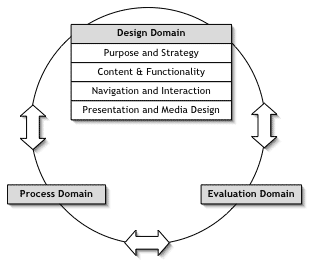
There are commonalities and there are bodies trying to create international usability standards, including for web interfaces. This isn't published but the model below shows the wider reference points for considering web interfaces.


The standard will detail guidance in four main areas:

  1. Purpose and strategy. What is the purpose of the site and how is this made clear to its users?
  2. Content and functionality. What is the site’s conceptual model? How is content organised and how should the site deal with issues such as privacy and personalisation?
  3. Navigation and interaction. How should the content be organised so that users can navigate the site easily? How will users search the content of the site?
  4. Presentation and media design. How should individual pages be designed so that people can make use of the information? How should multimedia be used?
Where I think culture does impact, particularly in a discount usability setting may be in the interaction between the tester and the user — for example, it may not be appropriate for people to be as critical as you would like, they may defer to you.


Not essential

There's also the point that the technology itself can reflect one culture's norm - most obvious is the 'boysey' nature of some gadget and game design. Plus there are gender differences in the way people use the web.

But, my general feeling, though, is that - well - fretting on this can obscure the very discount basis of the testing — specific design issues need specific testing to get right (or as near as dammit/budget allows), just as with accessibility.

Discount testing is simply about getting you out of the woods, so to speak.

Plain Google home page gets facelift

An example of a personalised Google home page. .

An example of a personalised Google home page. .

Sydney Morning Herald
March 20, 2007 - 2:29PM

Jazzing up its famously plain website, Google is offering a new option that places its internet search box in panoramic settings that change with the time of day and the weather.

The colourful graphics will be unveiled on Tuesday.

While most of Google's users remain content seeing little more than the company logo and the search box that has anchored its home page for nearly a decade, millions of others have created log-ins that enable them to select from a variety of features that appear with each visit.

The features, introduced nearly two years ago, include stock quotes, local weather and news headlines.

Google's new package of decorations, also known as "skins", are designed to make the home page feel even more homey, said Marissa Mayer, the company's vice president of search products and user experience.

"Google has become the doorway to the internet for a lot of people, so we want to make (the site) feel more like an online living room," Mayer said.

"We feel we are personalising things in a very tasteful and useable way."

Rival Yahoo Inc already has been experimenting with a broader selection of decorative themes as part of an upgrade of its "MyYahoo" service.

"This is a much bigger step for Google because they have always prided themselves on their plain white pages," said Dan Cohen, who worked on the personalisation efforts at both Google and Yahoo before recently becoming chief executive of Pageflakes Ltd, a startup that customises Web pages.

The use of more graphics illustrates Google's evolution from a once-pure internet search engine into an all-purpose website that offers email, news, photo sharing, instant messaging, shopping and mapping services.

The diversification over the past five years has raised worries that Google might be overextending itself, but the expansion has not hurt so far. Google more than doubled its profit to $US3.1 billion ($A3.88 billion) last year.

Reflecting its cautious approach, Google's first set of decorations consist of just six themes revolving mostly around landscapes. The settings include a Japanese tea garden, a beach, a city skyline and a bus stop. Google plans to introduce a few more themes each month and eventually may accept outside submissions, Mayer said.

Google has programmed the decorations to reflect what is happening in the outside world.

Users are asked to enter their post code so the digital drawings change from day to night and change with the weather.

The designs also will contain hidden surprises known as "Easter eggs" that will open up with an opportune click at the right time of the day, Mayer said.

She would not reveal any of the surprises.

More about this on John Battelle's blog

If you click on the "select theme" link, up comes a box of several themes you can choose. The list includes; Classic, Beach, Bus Stop, City Scape, Sweet Dreams, Tea House and Seasonal Scape.

google-home-theme2.png

I selected Bus Stop, which looks like this:

google-home-theme3.png

Google then asks you to enter in your zip code so that the theme you selected with dynamically change based on your currently weather. I suspect that if its snowing, there may be snow around the theme, and so on.

It's not on my Google UK personalised homepage yet, but I jiggled it to google.com and - voila! I love the 'Sweet Dreams' theme and it took my UK location. let's see how it changes ...


Here it is - at twilight. It's been changing gradually all day...


and at midnight


Tuesday, March 20

Historic origins of usability testing

The Usability Testing Central blog has an interesting, compact history of usability.

World War II was the starting point of electronics and electrical systems controlled by human operators through a "user interface". Industrial psychologists such as John Flanagan discovered that by reducing the amount of buttons, knobs, switches and control panels in new fighter aircraft- they could also dramatically improve operator performance.
This led to something called the Critical Incident Technique (or CIT), used in the transition of the Supermarine Spitfire to the P-51 Mustang fighter cockpit.


The 50s + 60s established a lot of the basic hardware and software but the next key marker was the establishment of Xerox's PARC (Palo Alto Research Center)

Xerox is largely responsible for much of the innovation in user interfaces (still in use today!). Many know these as WIMP (Windows, Icons, Menus, Pulldowns). Xerox R&D work and resulting usability and user interface innovations propelled the current age of corporate usability research.

This led to the Apple Mac and usability became the norm in computing R+D.

Then came the web and , in particular, the explosion of unusable websites during the dotcom boom. See the infamous boo.com, right.

Eventually the usability gurus Jakob Nielsen and Steve Krug prevail.
"In our first year we didn't spend a single dollar on advertising... the best dollars spent are those we use to improve the customer experience." - Jeff Bezos, Amazon.com
Now we're at Web 2.0 and the phrase is 'user experience'.

Vote Different

This smart anti-Hillary vid - which directly steals from the famous Apple 'Superbowl' ad from 1984 - has already had 1,055,627 views in TWO WEEKS.

Better Connected, 'Accessibility' and all that


My fellow blogger Jack Pickard, who does a job not a million-miles dissimilar to mine, has commented on the controversy raging amongst UK eGov, focussing on accessibility.

It started with the annual SOCITM report on local government websites: Bettter Connected [parodied, right, by Public Sector Forums].

This report includes a section about accessibility, which uses a number of methods, including the universal standard devised by an organisation called WCAG , as well as the RNIB and Usability Exchange, to come up with a score — and herein lies the controversy.

The website Public Sector Forums reports very directly, exclaiming Why Better Connected 07 is garbage.

Another colleague Dan Champion weighs in with a more measured tone.

And now Jack:

Let’s stop saying that WCAG is a measure of accessibility. It isn’t. WCAG shows you things you can do that will likely make your site more accessible. But throw some real people at your site and it either will or it won’t be accessible to them, irrespective of what your WCAG conformance level says.

Remember: WCAG Conformance is not the same as accessibility.

Real people. Real tests. Real progress?

This is the point. Who does it gain to dance around with one wrong line of code on one page out of several thousand? (Which is actually to a large extent what's at the back of this - one wrong line of code).

Move on: Getting input about the content from disabled people is something you can do whilst you fix that pesky code.

Because if people with disabilities are just gaining access to a whole lot of confusing councilese, what are they gaining? Frustration?
  • Are you duplicating info that others provide?
  • Are you directing people to the right sources (online + off)?
  • Are the resources allocated in the budgets to get this right?
  • Is your content of any practical use?
I agree with Jack. To me accessibility goes way beyond WCAG.

It would be a great help for eGov and disabled people if we focussed on usability, for one. Which we don't really do.

We do this where I work in a more formal way but, as well. here's a couple of things I've done:
  1. Sent things to disabled staff. In particular I have one blind staff member who I copy in occasionally. She looks at stuff and can tell me there and then whether it works or not. That simple fact has proven enough to get people to jump and move. Even without the blind person right in front of them. [accessify forum is another good place from practical guidance].
  2. Shown people the web from a disabled person's perspective. Done this twice with dyslexia (an-ex member of our team) and screen readers - that generally blows people away.
I tend to sit accessibility in, amongst others, a usability framework. This doesn't just make practical sense, as above, Jakob Nielsen has been writing about the subject for some time.

In 'Beyond Accessibility: Treating Users with Disabilities as People' he argued that:

It's time we moved beyond technical accessibility when discussing how to improve the Web for users with disabilities. We should consider these users as users: As people who have jobs to perform and goals to accomplish when they use websites and intranets. Once we've achieved technical accessibility, our new goal must be task support and increased usability of websites and intranets for people with disabilities.

Sure, users with disabilities are disabled, and many must use assistive technologies to access the Web. Obviously, websites must be accessible through alternative user interface devices, such as screen readers and screen magnifiers. If you can't get at the information or services that a website or intranet offers, then you definitely can't use it either. But, just because a design is theoretically accessible, doesn't mean that it's easy to use, simple to learn, or supports efficient job performance.

> article continues <

Nailed it, Jakob. In 2001.

Getting usability right means getting accessibility right.

Accessibility in eGov also sits within a wider context: where's the budget for content, for example? Where's the centrally produced, easily repurposable content? Is there policy?

We can buy feedback from differently disabled people but where's the simple methods and practical advice for real user input?

But the focus is so much on the technical - driven by both Whitehall, geek fascinations and commercial interests and exacerbated by living in our own, web bubble - that these sorts of, practical, questions are drowned out and non-technical people excluded

Here's a postscript from Bruce Tognazzini, talking to business:

Designing for the Differently-abled

Guess what? Designs for the disabled don't have to hurt usability for the normally-abled. In fact, if you are doing your job properly, your designs will help everyone.

Lots of myths surround the whole disabled issue. First, you can give up thinking of yourself as permanently-abled. Most of us will end up with increasing disability, starting at age 40 when our eyes begin to go. If we live long enough, we can plan on a whole bunch of other systems to go, too.

We also tend to become temporarily disabled, and I'm not only talking about breaking your leg skiing. How about if you are trying to wheel a heavy suitcase down the street from where the cab abandoned you? Do you think that curb cut might turn out to be a good thing? When you get to the hotel, that silly ramp is going to look pretty good, too.

It is the same thing in software. Make an application usable by the blind and you have also given everyone else access to a powerful keyboard interface, particularly useful when struggling with an inferior pointing device on that cute little portable. (Nothing like a laptop or palmtop to make you temporarily disabled.)

Designs for the disabled can be screwed up. Apple created a special mode for the visually impaired in the early days of the Macintosh that would blow up a portion of the screen really big. It should have been useful for all users, but they had implemented it in such a way that you couldn't easily show and hide the expanded window. As a result, half your screen disappeared long-term. That was a reasonable price to pay for the visually-impaired. It was too high a price for the rest of us.

What to do

When you design for the disabled, do as Good Grips did:

• Design and usability-test extensively for the disabled.

• Also test across a broad spectrum of users as well, and keep a constant eye out for how your work can improve the lot of all users.

• Ensure that elements of your product do not actually impede its usability for the rest of us.

By the way, if you know the guy who is responsible for that toilet in the handicap stall with the seat four feet off the ground, how about passing this column on? I'd like to be able to leave my step ladder at home.

Geek heaven: Swivel


What is Swivel?

Swivel is a place where curious people explore data — all kinds of data.

Swivel lets you explore data and share your insights with others. Swivel has data about politics, economics, weather, sports, business and more.

Swivel is full of good stuff. We think of it like this:

  • Explore popular data or obscure data. Search for it or have fun cruising all the colorful graphs, data sets and opinions.
  • Compare gas prices to presidential approval ratings or UFO sightings to iPod sales. You might find a crazy coincidence or something more.
  • Share your insights by posting a graph to your blog or emailing a link to your friends and coworkers.
  • Upload the information you care about, describe it, pick a color scheme and even pick a cool photo to bring it to life.

If you're curious about data, Swivel is the place for you.

Thrown Out Onto the Street

Swiveler mikek highlights apartment evictions in San Francisco under the California state Ellis Act. The law allows apartment owners to evict residents, usually with the goal of repurposing units into condominiums. However, this data also demonstrates the ability to drop a raw list into Swivel and having our crunching power do the work for you!

Monday, March 19

US Prez election: Web Video Reviews Are Mixed


Interesting article from the Washington Post about how the US Presidential election is panning out on the web - since the article, MySpace has announced it's to launch an "Impact" Political Channel focused on the election now a mere 20 months away!

As elsewhere, article's about how video will dominate this election - only not the sorts of video which candidates have (had?) been producing, instead it's the 'Macacca'-type balls-ups, comedy-skits and other viral-types. [and maybe direct responses to voter's questions]

Article bigs up WebCameron, which I don't think has exactly set the YouTube generation alight ... what has - and by accident I think - is Tony blair's appearance on ComicRelief.

If you haven't seen it, don't miss - absolutely hysterical. Hate him, love him, it's just plain funny — this is the take of YouTubers from the masses of positive comments. [They also seem to love mash-ups, which are the stock-in-trade of shows like the BBC's Dont Watch That Watch This.]

So Blair and Catherine Tate's skit precisely hits the button for what works with users video-wise on the web. Damn.


Candidates Try Web Video, And the Reviews Are Mixed

By Jose Antonio Vargas
Washington Post Staff Writer
Saturday, March 17, 2007; A01

Sen. Hillary Rodham Clinton (D-N.Y.) posts regular "HillCasts" to talk about her positions on equal pay, health care and Iraq. Rudolph W. Giuliani treats YouTube as if it were C-SPAN -- a place for his 58-minute speech to the Churchill Club. Sen. Christopher J. Dodd (D-Conn.) put up a casual backstage interview before his appearance on "The Daily Show." And though Sen. John McCain (R-Ariz.) was the last of the presidential front-runners to jump on the online video bandwagon, he now has more than 25 videos circulating on the Web.

One after another, presidential campaigns are adding videos to their Web sites as well as to video-sharing sites such as YouTube, MySpace and Veoh. The reviews, however, are mixed. Production values are uneven -- a few videos look grainy; many are professionally produced; most seem downright misplaced. And so far, judging by the number of views on YouTube -- and the overall buzz on the blogosphere -- it's the candidate videos that the campaigns didn't make that get attention.

Not one of the videos made by John Edwards's campaign, for example, matches the popularity of the one showing the former senator combing his hair before an interview to the tune of "I Feel Pretty." That video has been viewed more than 135,000 times since it was posted on YouTube in November. Edwards's most popular official video, of his announcement in December that he's running for president, has been viewed about 116,000 times.

Similarly, Clinton's most watched HillCast, titled " Roadmap Out of Iraq," comes nowhere close in popularity to the video showing her singing " The Star-Spangled Banner" off-key at a rally in Iowa. The HillCast has been viewed more than 15,000 times since it was posted on Feb. 17, the out-of-tune moment nearly 1.1 million times since its posting on Jan. 27.

As fans of Web video know, YouTube is a place of irreverence, spontaneity, humor. And for the most part, candidates are giving their online audience the opposite of what it wants. Just ask James Kotecki.

Several times a week, Kotecki, a self-described "political geek" turned YouTube celebrity, advises presidential candidates on their campaign videos -- from his dorm room at Georgetown University. Equipped with a three-year-old laptop, a $60 Web camera and a $30 microphone -- and a small, dusty desk lamp as a light source -- the 21-year-old dishes out free, unsolicited suggestions (and the occasional compliment) to the candidates.

For Giuliani: "All of your videos so far are just recordings of your speeches. And two of them are marathons, clocking in at 45 minutes and 58 minutes."

For Rep. Dennis J. Kucinich (D-Ohio): "The ivy background, I'm-outside-but-I'm-really-inside thing, doesn't strike me as overly presidential. I'd also encourage you to make your videos a bit more intimate by bringing the camera closer in to you."

For McCain: "Maybe it's time to post a funny video."

Kotecki has one recurring message to the candidates and their expensive media advisers: "The Web isn't TV." As in, Web viewers don't expect to be spoken to, they expect to be spoken with. It's a passive experience vs. an interactive one.

Other students of the genre have similar advice.

"Look at how the candidates are talking in their videos. With a few exceptions, they're mostly looking sideways, not talking directly to the camera," said Jeff Jarvis, who heads the interactive journalism program at the City University of New York's Graduate School of Journalism and started PrezVid.com, a blog dedicated to watching the campaign through YouTube. "The important thing about this medium is it's very human and intimate. A voter comes across and clicks on you. You should talk to that voter and look at him in the eye."

Micah Sifry, co-founder of TechPresident.com, another blog that looks at how the candidates are campaigning on the Web, also makes a distinction between video online and ads on television. "There's something fundamentally different about video online," he said. "Viewers are looking for that rare, unscripted, revealing moment, to get a little sense of who these candidates really are."

For campaigns, Web videos are an instant way to reach voters, whether on the candidates' sites or on YouTube, which this month created You Choose '08, a channel specifically for candidate videos. They are a way to present Clinton sitting on a couch, sans microphone. A way to hear McCain talk uninterrupted about "honor," "courage" and "faith" (each one is a video clip). They are giving candidates a face, a voice and, most important, a personality -- at least if done right.

So far, none of the official campaign videos have been used to attack a rival candidate. And while the videos tend to be similar, there are differences in approach.

Some candidates are employing a "less is more" mantra. New Mexico Gov. Bill Richardson, for example, currently has three videos on YouTube. For others, such as Mitt Romney, more is more. "We're doing as many different kinds of videos as possible -- videos of him giving speeches, testimonials from families, et cetera," said Stephen Smith, director of online communications for the former Massachusetts governor.

All of the campaigns, however, are still experimenting, watching each others' moves.

Christian Ferry, McCain's Web manager, says bluntly: "We're only at the very beginning here, and our videos are still evolving."

As an early model, Jarvis and Sifry both point to British politics and David Cameron, the leader of the Conservative Party. Last fall, Cameron launched WebCameron, which includes a series of short videos starring the 40-year-old father of three. His first video showed him washing the dishes at home, his baby screaming in the background.

Looking directly at the camera, standing in front of his sink, he says, "Watch out BBC and ITV, we're coming after you."

That was an off-the-cuff, unscripted moment -- or at least it appeared that way. To Sifry and Jarvis, it seemed "authentic," and therefore effective.

Yet as in vogue as online videos are, no one is sure of the impact they will really have. Or whether, in this Web-based, heavily fragmented mediasphere -- in which everybody is competing for shorter attention spans -- they will eventually replace TV spots, the bread and butter of campaign advertising.

"These videos are a giant step forward from saying, just three years ago, 'Here's our latest blog entry,' " said Jim Margolis, a veteran Democratic media strategist. "But are people going to get sick of them? You'll get 23 videos on your inbox and you'll delete them all? Who knows? I don't. This is all new."

In the meantime, Kotecki is a new critic for a new medium. He has recorded 42 videos in his dorm room since Jan. 27 -- often late at night, sometimes in the afternoon between his quantum physics and Introduction to Logic classes.

His YouTube channel has more than 400 subscribers, and his videos have been viewed more than 71,000 times. He makes up awards and bestows them on candidates; Romney earned one half of a "YouTube Savvy Award." He also makes sound effects -- "Ding!" -- and, on occasion, sings and raps.


James Kotochi
James' interests include 'Being quoted in the New York Times'
Some of the campaigns, including Edwards's, have contacted Kotecki via YouTube, and Smith, Romney's Web man, said with a laugh: "We appreciate the half of the award. We'll earn the other half. It's early."

Yesterday afternoon, Kotecki received his biggest reaction yet -- a video response from Kucinich himself, who called Kotecki "my adviser."

"I think you have some good suggestions," Kucinich told Kotecki, "and we're already taking them into account."

The video, only 50 seconds long, is a close-up shot.


Candidate links