This is from MarketingSherpa.
Nielsen et al have found that banner ads are typically 'tuned out' by users and this study recognises this and looks at test methods by which you can greatly increase their effectiveness.
The bottom line is that you need to running multivariate tests on creative content as part of optimisation instead of relying on industry research (is your ad provider doing this?).
Report says that creative issues were the dilemma that Kevin Kohlmeyer of Rural Cellular Corp faced.
They tried several different copy combinations but didn’t know which worked best. Nor did they know which phone product lured the most consumers to click through and learn more about their services package. Plus, they didn’t know which banner size was optimal.
“For these types of things, we had been looking at industry research to find what certain attributes existed that could be important to consumer prospects,” Kohlmeyer says. “But, we needed to take some steps to verify what really worked for us in particular.”For Flash banner ads the test included 36 different possible content combinations.
In the end, the goal was to put together a *super banner* with the top-performing creative elements for the campaign.
The key variables are:
1. Copy
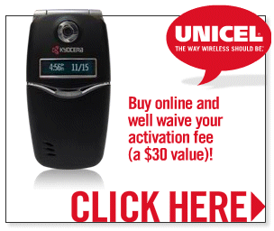
They tested four lines of copy. Each was attached to an ad with the picture of a cell phone being offered with the service package.
The copy they tested:
- “Buy online and get free shipping on your order”
- “Buy online and we’ll waive your activation fee”
- “Buy online and get free shipping plus no activation fee (over a $30 value)!”
- “Start Shopping Now!”
“We looked at what products consumers were selecting once they were already to the site. It made sense that they would bring in prospects as well.”So, they tested three popular, low-to-medium-cost phones that already were working on their ecommerce site:
- Motorola v197
- Motorola Razr
- Sony Ericsson w200
Using the right banner size will dramatically improve clickthroughs and sales. Either:
- 300x250 (box ad/often called a “big” ad)
- 160x600 (skyscraper)
- 728x90 (leaderboard)
- “Start Shopping Now” copy won out over “Buy online and we’ll waive your activation fee” by 12.2% in clickthroughs.
- “Start Shopping Now” copy got 16.6% more clickthroughs than “Buy online and get free shipping on your order.”
“Getting rid of the ‘loser content’ did help produce a [response] spike. And, what the testing also did was validate some hunches we had or reconfirm what we had seen in the past. At the same time, the fact that ‘Start Shopping Now’ was the best performer was a surprise to us. In the past, we had assumed shipping costs and activation fees were a barrier to purchase and emphasized the fact they were free online. This appears to have been an incorrect assumption. So, we’ll start downplaying it in the future.”As for which product won:
- Motorola v197 beat the Motorola RAZR by 4.5%.
- Motorola v197 beat the Sony Ericsson by 12.2%.
- The 300x250 banner (box ad) beat the second-place 160x600 banner (skyscraper) by 27.3%.
- The 300x250 banner trounced the 728x90 (leaderboard) by an even bigger margin.
The data generated by the test was used to build the super banner that saw a 50.4% increase in clickthroughs in their next campaign.
“A lot of our sales -- originating from banners -- come over the phone and via other channels. Banner advertising is a significant traffic driver for our multichannel efforts. And this test has helped us improve along those lines.”
 @PubSecBloggers


http://uggloveboots.blog.friendster.com/
ReplyDeletehttp://uggshoe.blog.friendster.com/
http://uggloveshoes.livejournal.com/
http://uggloveboots.livejournal.com/
http://warmugg.livejournal.com/
http://uggshoes7.livejournal.com/
http://uggshoe.livejournal.com/
哈~_~
This comment has been removed by the author.
ReplyDeletehttp://www.edisonnation.com/users/bestomijia/blog_entries?page=2
ReplyDeletehttp://www.edisonnation.com/users/enjoywatch/blog_entries?page=2
http://www.edisonnation.com/users/heuerwatch/blog_entries?page=2
http://www.edisonnation.com/users/imtatbag/blog_entries?page=2
http://www.edisonnation.com/users/jewellerybests/blog_entries?page=2
http://www.edisonnation.com/users/jewelleryrings/blog_entries?page=2
http://www.edisonnation.com/users/loseweightcapsules/blog_entries?page=6
http://www.edisonnation.com/users/onlyforbag/blog_entries?page=2
http://www.edisonnation.com/users/onlyuggc/blog_entries
http://www.edisonnation.com/users/ppsjewellery/blog_entries?page=2
My cousin recommended this blog and she was totally right keep up the fantastic work!
ReplyDeleteFlash Banner Ads